
Hey there. If you’re still a follower here, I’ve moved the blog over to my real, big-boy website: http://www.moulindiesel.com. I post there now and if you didn’t get the memo, please check it out and continue to read there. THANK YOU!
Uncategorized
CategorySkills Learned from Drawing (and Balancing it All, with Tutorial)
If you go through forums and ebooks for freelancers and designers there’s always someone who’s asking if they need to be able to draw to be a good designer. The response is always essentially “no, but it helps.” Being someone who’s been drawing his whole life I see this principle clearly. The things I understand and execute as an artist I think make my designs better. Of course this depends on where a design project is at on the spectrum. A flat logotype won’t require the same amount of “artistic” acumen that a gig poster may, and even a gig poster won’t need as much as a portrait.
Knowing how to draw doesn’t necessarily always mean being a great figure artist. While that is a powerful skill to have, just having a deeper understanding of how to make two dimensional shapes appear three dimensional without automating the process is, in my opinion, an even more crucial ability to have. One should understand how light and shadow work on objects, and on the surroundings. One should learn how to draw or paint shadows and reflections, and study how these change depending on the surfaces in question.
There are a lot of features included in graphics apps that will supposedly do much of this work. From layer styles in Photoshop to lighting a 3D model it’s possible to create decently convincing pieces from clicks and dialogue boxes. I still advocate, though, that having that deeper understanding from drawing will allow the designer+illustrator the ability to visualize what he or she wants, to view the results critically, and to devise an approach to create what they want rather than what they were given by the software. It is through this process that one can create something better, I believe.
Right now the “long shadow” look is trendy for icons and typography. Any Jack-ass can slap a drop shadow from a built-in feature of their graphics app, but in many cases that’s not going to push it past mediocrity. Good designers will go create the shadows and the supporting elements by hand.
Here’s an example from my own work, a graphic to show prospective clients what they will be getting if they hire me to do a digital pet portrait. This is featured on every listing in that particular Etsy shop, and I send it out to people outside of Etsy who are deciding.

As is usual with my workflow for these kinds of projects I build the layout and basic shapes in Adobe Illustrator. I believe it’s important to nail down a good design before worrying about the sweet effects. Therefore, I preplan all the supporting text and add-ons when I build. All the basic colors of the graphic were designed here as well. I don’t jump over to Photoshop until I’m satisfied with this phase.

In Photoshop I start with a flat color layer of the same hexidecimal value (#f7f7ec) as my plan in Illustrator. My style tends to have a dreamlike quality to it and thus I’m always one for subtle color shifts all over the space. I search my design resources folder and choose a blurred background gradient from digitalspace.com. I place it and resize it to fill the canvas, and set it to Hard Light blending mode and 33% opacity. On top of this, I stack another copy of it, completely desaturated and set to Multiply and 10%. This did two things: brought out some richer color variation and desaturated the space a bit. I don’t need it competing with the main graphic.

I love the lilac hue hinted in the corner, and the range of other hues represented here. The values in the blurred background also imply a light source in the upper left corner. That’s perfectly aligned with what I’ve envisioned so the whole thing’s off to a good start.
Now, can I copy and paste the shapes in from Illustrator as pixels. These are isolated pieces I can work with and the colors paste with them. On top of each of the outer shapes in turn, I marquee them with the Magic Wand and put a black-to-transparent gradient on each one. The angle is 135° to match the implied lighting from the background. I set the blending mode on each gradient to Overlay, and this gives me a kind of lit up effect on each shape. However, each color reacts differently, so the orange and the blue shapes get 50% opacity on the gradient while the tan one gets 40% and the brown gets 32%.
Even though I want a long shadow underneath the graphic, not every shadow in the whole thing will be long. This is where a good grasp of lighting is crucial to make a convincing overall image. Over time I’ve learned that one or two really sweet effects in an image need a supporting cast. Most people will notice mainly the long shadow, but there are other little things that help sell it. Here, I marquee the white shape in the center and, using a soft brush at about 20% opacity I paint some little shadows under the overlapping points from the color shapes. Again, an idea of how lighting works comes into play because not every point will get the same treatment. Each one has to be taken on its own merit and you’ve got to consider the light direction, intensity, and the height of the overlap illusion you’re trying for.

Now for that long drop shadow. I marqueed the entire table by SHIFT+CTRL+clicking on each shape’s thumbnail in the layers pallet. The resulting selection was filled with black on a new layer underneath the table. This new shape was sent through the Motion Blur filter at the 135° angle and at the maximum distance of 999 pixels.
The result is a pretty cool long shadow on the lower right side, but it extends both directions and that creates a problem. Easy fix, though. Just take a moderately-soft eraser and remove everything that extends towards the light. Finally the whole shadow layer is set to 80% opacity.

Already this is looking pretty cool.
Next, I add the icons and text. The JPEG icons were just some stock icons I had that I added a bokeh background into along with my Black Dog mascot. The ZIP box icon is from the same set. The PDF icon is from Adobe’s site.
All of the text is copied and pasted from Illustrator. There’s no need to try and recreate it with Photoshop’s text tool. I’ve already done the work, especially with the curved text on the shapes. The text and the icons were given a drop shadow consistent with the lighting scheme I’ve already established. Granted, these are layer styles, but remember this effect is a supporting cast member. Layer styles are great for adding nuance but should never, in my humble opinion, be the main event.
The ZIP box just didn’t look right with the drop shadow, so I made a judgment call and bent reality a bit. I ended up airbrushing (soft round brush set to 50%) black under it, and set the layer to 30% opacity. Just needed contrast and depth is all.
The final bump to the title text is a Violet-to-Orange gradient set to Soft Light and 25% opacity.

I’m really into adding some drama. In this case it’s a bit of a flare effect in the corner. You’ve got to do this tastefully. Don’t get me wrong: I love lens flares. But lens flare abuse really aggravates me and I’ve seen flares used as a band aid to compensate for a lack of skill in a lot of otherwise nice pieces. You’ve got to take the big picture in mind and adhere to the mood, to the feeling, and not get a hard-on over flares for the sake of flares. Yin & Yang, baby.
The flare here was easy-peasy. Just fill a new layer with black, and use a soft brush to paint a warm shape in the corner. Start with a pale yellow in the center and orange and crimson on the edges. Don’t get too crazy with the saturation; this needs to be a subtle effect, so keep the colors at about 50% saturation. My best buddy as far as colors go is the HSB pallet. I get a lot of use out of that and the tweaks on the sliders are far more intuitive for me than the RGB or CMYK pallets.

Now set that layer to Screen blending mode and 66% opacity. BAM. A nice little bump to the overall image.
Another one of my favorite techniques is to add fresnel effects. This is so bloody subtle most of the time you wouldn’t even see it unless you watched me toggle the layers on and off. I take a soft round brush with white, set to 20% opacity (and since I just tap with my Wacom tablet it’s probably closer to 5% to 15%) and I pick two or three things to add it to. In this case, the upper left corners of about three icons (most noticeable on the PDF icon).
I do this fresnel bit ALL OF THE TIME to just about every piece I do, whether it’s a design, photo retouching, or fine art. Definitely one of my favorite techniques and it’s an important part of the “supporting cast.”
ONE LAST THING: to bring up the value of the whole image I finish it off with an action I made called “Dreamlight.” It creates a solid fill layer of a pale blue-grey (#c0c8d1) and sets it to Overlay and 13%. Once again, a subtle addition, but it adds just a bit of lift to the entire thing.
And there you have it:
In all honesty I could have stopped at the Illustrator phase. If I wanted a flat style, which is also trendy right now, or just wanted something minimal and functional I totally could have pulled it off in just Illustrator. My other artistic urges always take over though and I want there to be a more evocative quality to it. Even though it’s just an informative little graphic I want it to create a feeling, to be an artifact from that world in my head.
Nonetheless, there has to be a balance. For example, I chose to make the flare effect by hand using a relatively low-tech solution, whereas generating an actual lens flare with a filter or plugin would’ve been overkill. The effect needed to be more about the feeling rather than “Hoo! Hah! Lens Flare!” (If you read that in a Johnny Bravo voice, you’re totally with me). Notice also that I drew from a deep bag of tricks, but each one has to be applied effectively. You can’t be heavy handed or throw every trick you can think of at it. In the end this graphic still needs to impart information. I just think it should be beautiful too.
Hopefully I’ve given you some good ideas to add to YOUR arsenal, as well as helped you reconsider the value of basic drawing skills (if you don’t possess them). Comment and let me know what you think, or weigh in on my opinions. Dialogue is always welcome!
A Dieselpunk Elephant (and a short tutorial)
I wanted to share with you one of my recently completed personal pieces:
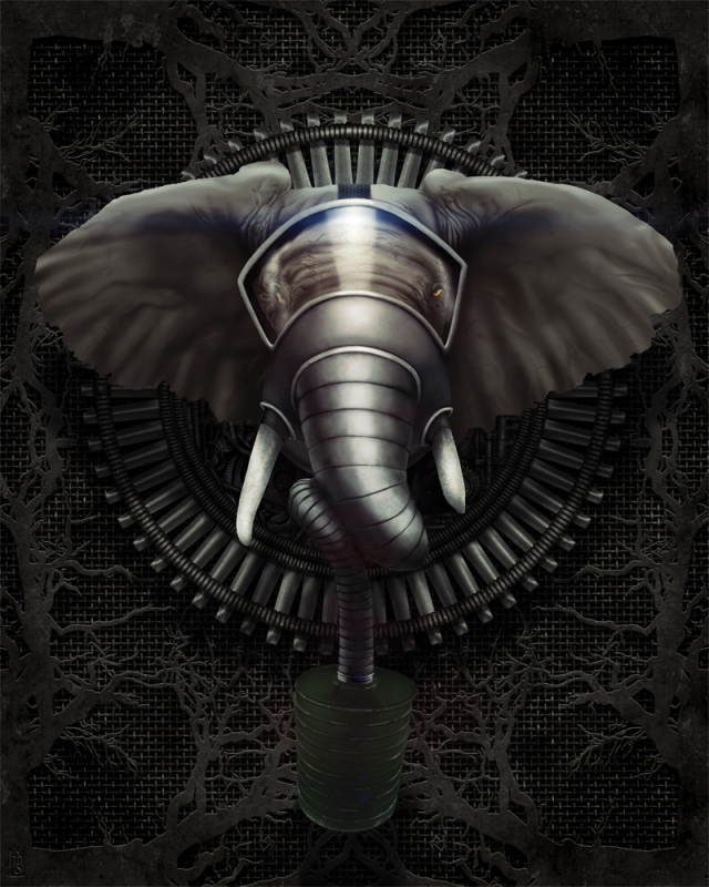
This the third in my surreal, dieselpunk-themed animal paintings.
Here’s a list of my Photoshop process, from back to fore:
- The mesh background is a seamless background from Ron Deviney’s “Cyborg Parts” set.
- A few grunge brushes over the mesh gave it a less uniform look and some distressing. Layer was 58% opacity set to “soft light” blending.
- That’s underneath the roots/tendril plate I made by drawing a tree with a hard brush, then copying and rotating three times to make the symmetrical, kind of rorschach test shape. This was given a layer style with bevel/emboss, color overlay and pattern overlay. Underneath this was a copy of the layer, filled with black, gaussian blur applied and moved down to simulate a shadow. 80% opacity on this.
- The middle ground is a geometric figure I made in Illustrator CS5, given a similar treatment to the “tree” plate. Layers below and above used bits from the “Cyborg Parts” set and the combination of layer style shadows, hand-airbrushed shadows, and surgical editing with dodge and burn gave it depth and volume.
- The elephant was painted by hand using greyscale photo references. Building it with the tried and true “mass before detail,” it gradually coalesced into a reasonably convincing elephant. The wrinkles around the eyes were a lot of fun to do! Since I painted in grayscale, I colored my elephant with a gradient map when it was finished.
- The gas mask was hand painted as well. I looked at a few references of gas masks, but since nothing like it exists in real life I had to wing it. This makes for some interesting problem solving. For example, what do you do about the tusks? I had to invent the rubber gasket around them, imagining holes in the mask provided for exactly that purpose. There had to be a wider glass to accommodate the face and beady little eyes. And of course, the canister hose that doubles as a repository for the trunk had to start wide and taper down. I’m pleased with how it turned out overall.
- The canister on the mask was actually modeled in Google Sketchup and imported into Photoshop were I painted over it, distressed it, and merged it with the hose. I wanted to get the perspective just right to convey depth in the picture and doing it in 3D made it a cinch. Google Sketchup is free, BTW.
- The elephant and mask were marqueed together to make a black fill layer underneath. Again, gaussian blurred, 60% opacity, and moved downwards to create a shadow over everything else.
- A separate layer of “shadow fixes” exists where the airbrush was used to mold shadows over shapes to make it more convincing.
- The rest is post production stuff and here’s the run-down:
- specular blooms (the cousins of lens flares–much more subtle) done with an airbrush at 50%.
- levels adjustment.
- A “desatch” layer — a full black fill, set to “hue” blending, and 10% opacity. This is really subtle, but it knocks back some of the more saturated areas to pull the piece together more. You could do this with a hue/saturation adjustment layer, but I prefer this method.
- A layer that is a hybrid of a texture from GoMedia’s “Etched into Dark” set, and a multi-hued, super saturated, radial gradient. This layer is set to color burn at 10%. Again, very subtle, but the added texture and seemingly random splashes of color that ghost the image is just one of my favorite things. I love that!
- A lens flare at the top of the glass, created with Red Giant’s Knoll Light Factory plugin (which is a badass plugin).
- And finally, a gradient map with the “yellow, orange, violet, blue” gradient, set to color dodge and 10% opacity. More off-the-wall coloration ghosting the final image. That’s kind of one of my things.
So there you have it. It’s a dark piece, but that’s what I wanted. Something industrial and noir.
This is available as a print in my Etsy shop.
You can also see the other two pieces so far in this Dieselpunk series on my website’s portfolio, or on my Behance page.
I hope this was informative and interesting to you! If you make something using some of the ideas or links I’ve provided, let me know. I’d really love to see it!
Gaming Peripheral as Art Tool
I have my favorite setups in both Photoshop and Illustrator, the two apps I use the most often. I use mainly the keyboard and my Wacom tablet for Photoshop, but Illustrator is all about the mouse and keystrokes. I rarely use my Wacom tablet with Illustrator unless I'm doing flourishes or tentacles or something. Most of the time my right hand is working the mouse and my left is operating shortcut keys and nudging things with the arrows.
I do quite a bit of design work in Illustrator. 90% of my graphic design work happens there. Even for some of my larger, painted illustrations a good deal of composition and line work is created in Illustrator before work is done in Photoshop.
For my Illustrator setup, I've been using a gaming peripheral, the Razer Nostromo, as my go to add on. I don't even play games on my computer (I'm too busy doing art!) so it's not even doing double duty; it's strictly been repurposed as my new left hand.

Razer devices come with apps that map out custom profiles and macros on the keys. I mapped the keys on the device to be all of the tool shortcuts and functions I use the most often in Illustrator. My fingertips hover right over 14 keys and a scroll wheel. My thumb works a D-pad, and two additional buttons.

I feel like it's really streamlined my workflow. I don't have to move my left hand nearly at all to press keyboard keys. 98% of everything I need is quite literally at my fingertips. Granted, working the keyboard isn't a difficult task, but the travel distance between X and D and A and V and ALT and R and the arrow keys and SHIFT and on and on…it adds up! Now it feels like I can fly through my work and my focus stays on the screen the whole time. The keys and combos are all committed to muscle memory now, and over a six to eight hour work session those aggregate split seconds can add up. I've been pretty psyched by it.
In all art, whether it's the process, or the execution, I think oblique approaches like this help a lot. A smoother workflow means one can concentrate more on the work itself.
What are some interesting, from-the-hip approaches you've come up with for your workflow? I'd love to hear about them!
Victory

Wanted to share with you some recent work I finished. This is a commissioned piece. It is a portrait of the client, depicted as a kind of spiritual avatar–younger, faster, and harder. The scene is a metaphor for the struggles and horrific hardships she had to fight through in her life to emerge not only as a survivor, but ultimately victorious. As a young girl, she was also an avid horse rider, and the freedom she felt being able to ride for hours on end with just her and her horse is something she dearly misses. This horse is an amalgamation of her horse from years before, and a powerful equine avatar fitting the scene.
The whole picture is intended to be something she can look at daily and gain strength as she faces her twilight years. It means a lot that I could bring this to life for her.
Now the technical stuff:
Primary subject was modeled in Daz Studio 4.6 using the following: Victoria 4.2 base, with ++morphs to adjust the face and body to fit the client. She supplied me with “mugshots” to use as references. She’s wearing the Shadowcaster outfit, and holding the DragonLord sword. The horse base is the Daz Charger with Astral Armor. The skin texture was painted on in post production.
The mountains and the sky each came from Stock.xchng (www.sxc.hu/)
Everything else was painted in photoshop CS5, plus adjustments and color layers. The final 16×20 print was rendered in 300dpi, CMYK.
Inaugural Post
Many firsts here. First post on my new ‘blog. First time on WordPress.
What do I want to do with this ‘blog?
Primarily, and I will be honest with you here, it’s a vehicle to increase my exposure. I’m working on building my freelance business up and everything I’ve read says, “GET A ‘BLOG!” So here you go. Got it.
Nonetheless, after mulling it over for a while I kept hemming and hawing over what, exactly, to say. A post I read on LinkedIn by Phil “Phresh” Rodriques said, “What’s important is content, sharing your own lessons learned and letting people see your work.” Eventually I got my brain going in the right direction and it occurred to me that I actually do have a few things to say along these lines. Plus, because I’m a cranky sort, plenty of other crap to say about other things. I will, however, attempt to keep things (mostly) art related.
Thanks for joining me!

Recent Comments